Stadium Wayfinding as a Design Archive
Stadium wayfinding reveals how a ground’s identity is carried through signs, maps and screens, helping designers preserve character while keeping directions clear.
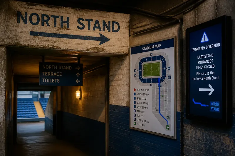
A faded arrow above a concrete doorway can tell you as much about a stadium as a polished screen across the concourse. Stadium wayfinding is more than a set of directions: its signs, maps and displays form a design archive, showing how a ground represents itself to the people who pass through it.
Rather than treating those objects as a tidy march from old to new, it is more useful to look at what each one contributes to the venue’s visual language. A hand-painted name, a printed map and an electronic message can sit side by side, each carrying a different kind of meaning.
What can a painted sign tell us about a ground?
A painted arrow or stand name binds information to its setting. The lettering may follow the texture of brick, sit beside a tunnel mouth or borrow colours used elsewhere in the ground. Even when it is plain, its material and placement make it part of the building rather than a separate layer laid over it.
That closeness can preserve a sense of local character. A sign that has been touched up over time may show small variations in paint or type, while a newer board might use a more consistent finish. Neither approach is automatically better. The question is whether the sign’s character helps people recognise the place without obscuring the instruction.
How do different sign formats shape a visual identity?
Every format gives designers a different surface to work with. A hanging board can carry a compact set of destinations. A printed map can show relationships between areas. A digital display can alter its message for a particular event. These are not simply stages in a single progression; they offer distinct ways to make a venue legible.
- If a painted name is still readable and marks a permanent destination, keep it in place; if the lettering has lost contrast, repaint or pair it with a clearer sign nearby.
- If a hanging board can be seen before a junction, use it to name the next choice; if it appears only after the turn, add a direction at the approach.
- If a printed map’s labels and route are easy to distinguish, keep its detail; if the key competes with the destination, simplify the map or give the route greater prominence.
- If a colour cue is paired with a name or symbol, it can reinforce recognition; if colour carries the meaning alone, add a word or clear icon.
- If a digital display carries a temporary instruction, keep that role distinct from permanent identification; if its message conflicts with a fixed sign, resolve the wording and route before displaying it.
- If a large screen is visible from the arrival area, use it for information that matters to many visitors; if people cannot read it from their approach, move or reorient the message rather than adding more text.
The useful design choice is often a combination. A ground can retain an old painted sign where it contributes both identity and clear direction, while a newer screen handles a temporary closure. What matters is that one object does not make another seem unreliable.
What do colour, lettering and materials communicate?
Colour can connect a stand name on a board to a marker on a wall, but it works best alongside words and symbols. Lettering carries a different tone: a traditional style may echo a venue’s older signs, while a simpler typeface may be easier to scan quickly. Materials matter too. Painted masonry, enamelled metal, printed paper and illuminated panels each create a different relationship with the surrounding architecture.
Designers do not need to make every surface match. A ground can have several visual voices and still feel coherent if arrows, destination names and symbols remain easy to recognise. It is not worth the effort to add decorative flourishes to every sign if they make the practical message harder to pick out.
How can a stadium keep character while updating its signs?
Start by deciding what each object is doing. A permanent stand name may deserve a durable fixed sign; a temporary route change belongs on a display that can be updated. A map should help visitors understand the layout, not imitate the look of a wall sign. Giving each format a clear role reduces visual clutter and makes updates less likely to contradict familiar cues.
Say a venue has a hand-painted “North Stand” name above a passage, a printed map that uses the same blue colour, and a screen used for event-day changes. If the passage name is still legible, retain it; if the map’s blue route is hard to separate from other information, strengthen its labels; and if the screen announces a temporary diversion, point visitors towards the first fixed sign on that route. The result is a design system that keeps the old name, improves the map’s clarity and gives the screen a specific job, rather than asking every object to do everything.
What questions help assess stadium wayfinding?
Should older signs be kept when a ground is refurbished?
Keep an older sign if it remains clear and contributes something distinctive to the building. If its condition or wording makes the direction uncertain, preserve its character in a replacement where practical, but make the route unmistakable.
Do all signs need the same typeface?
No. Different formats can use different lettering, provided destinations, arrows and symbols remain recognisable. Consistency in the information matters more than making every surface look identical.
When is a screen a better choice than a fixed board?
A screen suits information that may change, such as an event-day diversion. A fixed board is often the clearer choice for a destination that stays in the same place.
How can a ground show its history without making directions confusing?
Keep historically distinctive details where they do not obscure the route, and pair them with clear contemporary wording or symbols where needed. A visitor should not have to decipher a piece of design history to find the right entrance.
Stadium wayfinding is at its best when each generation of signs can be read on its own and as part of the wider place. For anyone reviewing stadium wayfinding, the useful question is not which format looks newest, but which objects still serve a clear purpose while keeping the ground recognisable.
A simple record can help before changes are made: photograph signs in context, note their purpose and mark whether each message is permanent or temporary. That small archive gives future designers something better than nostalgia to work from: a clear account of what the venue’s signs actually do.